Chart Objects in Report Studio |
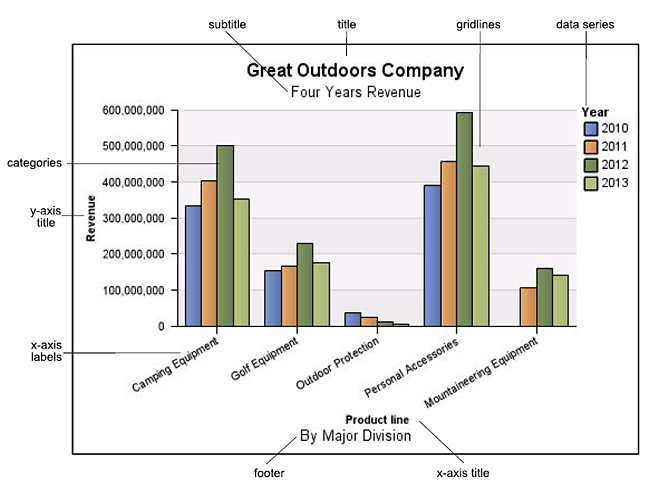
The following shows the most common chart objects as they appear in your report output in Cognos Report Viewer.
The following shows the same chart as it appears in Report Studio. The Y-axis is selected, and the axis titles are displayed:
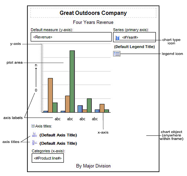
The default charts have more properties that allow you to customize more aspects of the chart than in earlier versions. You can click in different areas of the chart to get access to different properties.
For example, by clicking the axis, you can customize the color, style, weight, and transparency of chart axis lines and specify where to display major and minor gridlines on the chart.

A data series is a group of related data points that are plotted in a chart. Each series has a unique color or pattern and is described in the legend. You can plot one or more data series in a chart; pie charts have only one data series.
Categories are groups of related data from the data series that are plotted on the X-axis. Categories of multiple data series are shown together using clustered and stacked data markers.
Axes are lines that provide references for measurement or comparison.
The primary axis (or Y-axis) refers to measures of quantitative data, such as sales figures or quantities. Charts can have more than one primary axis.
The category axis (X-axis or ordinal axis) plots qualitative data, such as products or regions. It runs horizontally, except in bar charts.
The z-axis is the vertical axis in a 3-D chart.
Major gridlines extend from the tick marks on an axis and run behind the data markers.
Chart axes are lines that border the chart area and provide a reference for measurements. They act as a vehicle for tick marks and scales and form a frame around the chart. The Y-axis is usually the vertical axis and contains data. The X-axis is usually the horizontal axis and contains categories.
A legend is a key to the patterns or colors assigned to the data series or categories in a chart.
Charts use graphical elements such as columns, horizontal bars, points, bubbles, lines, and areas as visual representations of data points.
Related Topics: