Pie Charts |
Pie charts are useful for highlighting proportions.
Pie charts ![]() use segments of a circle to show
the relationship of parts to the whole. To highlight actual values, we
recommend that you use another chart type, such as a stacked chart.
use segments of a circle to show
the relationship of parts to the whole. To highlight actual values, we
recommend that you use another chart type, such as a stacked chart.
Pie charts plot a single data series. To avoid multiple pies when plotting multiple data series, we recommend that you use a 100% stacked chart.
The maximum number of pies that can be shown is 16.
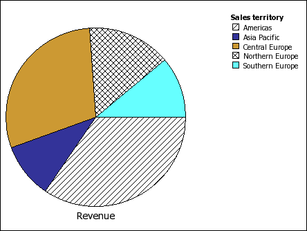
This pie chart shows that the largest proportion of revenue comes from the Americas, followed closely by the Central Europe region.
Pie charts can plot data using standard, 100%, and 3D configurations.
Related Topics: